Best Screen Colors to Reduce Eye Strain When Using a Computer
Spending long hours in front of a computer screen can cause eye fatigue, dryness, and discomfort. One simple way to improve visual comfort is to adjust the colors displayed on your screen.
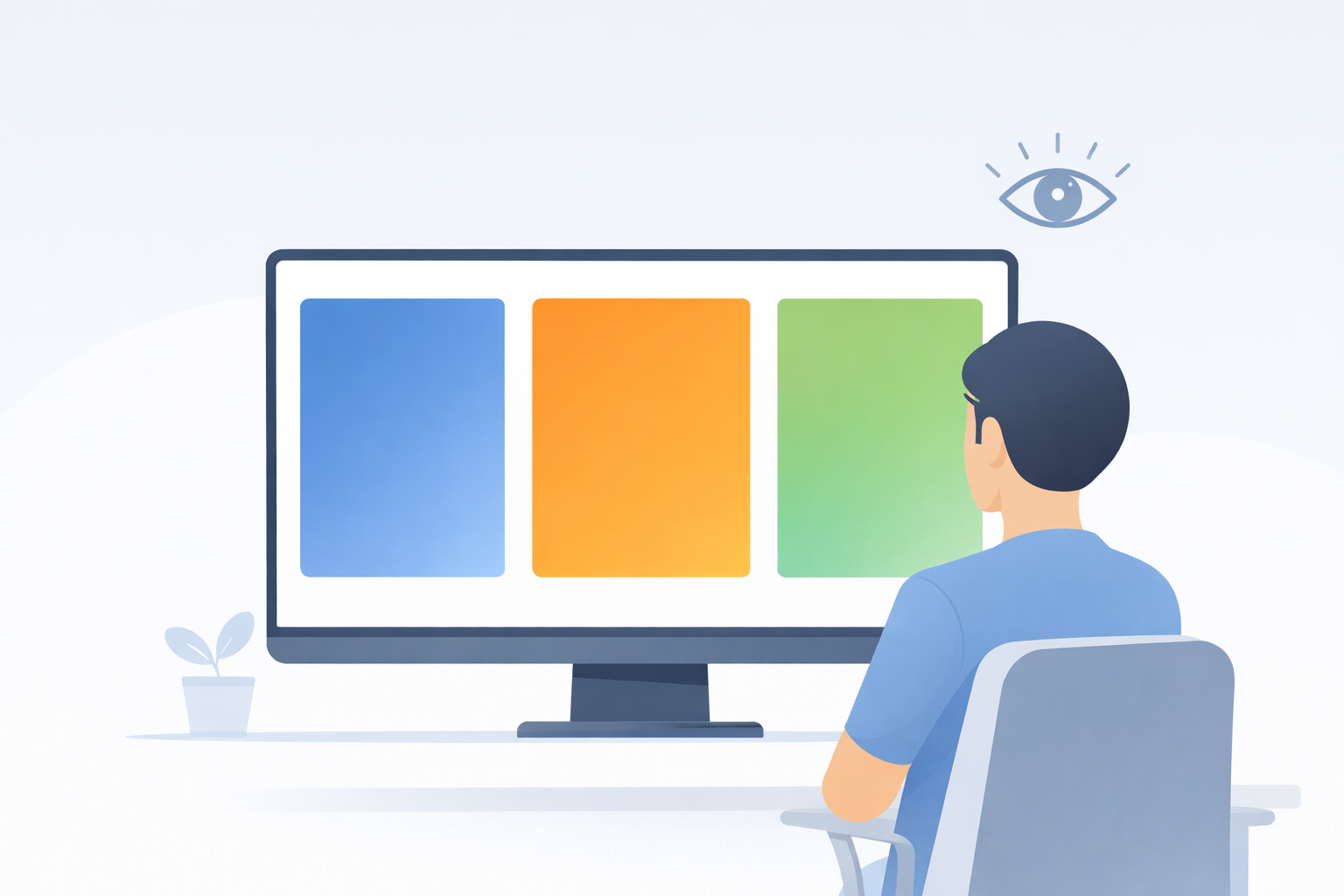
Fullscreen color backgrounds such as the white screen, black screen, or warmer tones like orange screen can help create a more comfortable viewing environment depending on your room lighting and work style.
Why Screen Color Affects Eye Comfort
Your eyes constantly adjust to brightness, contrast, and color temperature when looking at digital displays. Strong glare, high brightness, or overly sharp contrast can make long sessions feel tiring, especially when working in a dark room.
Using simple fullscreen colors can create a calmer visual field that helps your eyes rest between intense tasks such as reading, editing, or prolonged computer work.
Best Screen Colors for Different Lighting Conditions
Bright Rooms and Daytime Use
In bright environments, lighter fullscreen colors often feel more natural because they match the surrounding room brightness.
- White screen – useful when you need maximum brightness and a neutral background.
- Yellow screen – adds warmth while still keeping visibility high.
These options can reduce the contrast gap between your screen and the room around you.
Dark Rooms and Evening Use
In low-light environments, bright white backgrounds may feel harsh. Switching to darker or warmer colors can make screen use feel more comfortable.
- Black screen – ideal for reducing glare in dark rooms.
- Orange screen – provides a warmer visual tone for evening use.
- Purple screen – offers a darker mid-tone alternative with less intensity than white.
Using Fullscreen Colors for Short Visual Breaks
Short visual breaks can help reduce eye strain during long computer sessions. Switching to a fullscreen color screen for a minute or two gives your eyes a rest from detailed interfaces, small text, or moving content.
A uniform color background is easier for the eyes to process than a complex webpage or bright editing interface.
Warm vs Cool Screen Colors
Warm colors such as orange or yellow may feel softer in the evening, while cooler colors like blue can feel cleaner and more controlled in bright rooms. The most comfortable choice depends on your brightness settings, room lighting, and personal preference.
If you work late at night, warmer fullscreen tones may feel more relaxing than bright white. If you work in a bright office, white or light yellow backgrounds may feel more practical.
Simple Tips to Reduce Eye Strain
- Lower your screen brightness when the room is dark.
- Take a short break every 20 minutes.
- Keep your monitor at a comfortable distance.
- Use fullscreen color screens as a quick visual reset between tasks.
Try Different Screen Colors
Whitescreen.dev provides several fullscreen tools that can help you find the viewing environment that feels best for your eyes:
Each color creates a different visual effect, so testing a few options can help you decide what feels most comfortable during long sessions.
Conclusion
Screen color plays an important role in visual comfort when using computers for extended periods. By experimenting with fullscreen color backgrounds, you can reduce glare, soften contrast, and create a viewing environment that feels easier on your eyes.
Tools like the white screen and other color screens provide a simple way to improve comfort during long work sessions without installing any software.


